Our Brand
How it’s built, what it means, and how to use it
Our Mission
DocStation is pioneering a new era of proactive medicine by empowering pharmacists to spend more time with patients and get paid faster than ever before.
Archetype

The Magician
“It can happen!” (Transforming the healthcare system, that is.)
Voice
How our values translate to brand voice
Remember the patient
Ambitious, inquisitive
Be transparent
Illuminating, surprising
Measure what matters
Clever, concise
Lead with heart
Passionate, exciting
Teamwork makes the dreamwork
Warm, inviting
Our Voice
How we connect with our stakeholders
Empowering
- “Our mission is to empower pharmacists to provide clinical services and get paid for them.”
- “DocStation helps pharmacists get paid for what they love, get paid to spend time with patients instead of just dispensing meds, and operate at the top of their license.”
- “DocStation can change pharmacy practice for the better.”
Transformative
- “We can become an embedded part of the pharmacy practice.”
- “We have a big vision for pharmacies and dream big (like Steven Spielberg).”
- “We are solving problems in innovative ways that haven’t been done before.”
- “This can change the pharmacy practice for the better.”
- “We are super sophisticated, interoperable software that is forward thinking.”
Passionate
- “We get it.”
- “We are created by pharmacists, for pharmacists.”
- “We’re walking the line between simple and intuitive.”
- “We care for pharmacists, we care that we are communicating things correctly, and we care that our software does its job.”
- “Our heart is what makes us special.”
Our Logo
The symbol of our brand
Primary
Logo
Clear space
To control spacing dynamics, proper clear space should be maintained around the logo between it and other graphic elements. Use the width of the capital “D” to designate a clear space buffer around the logo.
Logo Don’ts
Don’t you dare
Don't use unauthorized colors
Don't adjust letter spacing
Don't use the logo as a photo mask
Don't tilt the logo
Don't lower the logo's opacity or use the logo as a watermark
Don't display the logo in one of our highlight colors
Don't append a tagline to the logo
Don't warp or distort the logo in any way
Secondary
Bugs/icons


Colors
The hues that light our fire
Experimental Blurple
- Hex #261d2f
- RGB
- CMYK
Hard Work Beige
- Hex #f7ebdc
- RGB
- CMYK
Old Ways Paper
- Hex #fefefe
- RGB
- CMYK
Innovation Flame
- Hex #fddb32
- RGB
- CMYK
Breakthrough Rorange
- Hex #ef4125
- RGB
- CMYK
Laser Focus
- Hex #3777ff
- RGB
- CMYK
Typography
The way the things we say look
Headings: HD Arnie
Aa Bb Cc Dd Ee Ff Gg Hh Ii Jj Kk Ll Mm Nn Oo Pp Qq Rr Ss Tt 1 2 3 4 5 6 7 8 9 0 ! @ # $ % ^ & * ( )
Subheads: Venn SemiExtended Bold
Aa Bb Cc Dd Ee Ff Gg Hh Ii Jj Kk Ll Mm Nn Oo Pp Qq Rr Ss Tt 1 2 3 4 5 6 7 8 9 0 ! @ # $ % ^ & * ( )
Body: Komet Regular
Aa Bb Cc Dd Ee Ff Gg Hh Ii Jj Kk Ll Mm Nn Oo Pp Qq Rr Ss Tt 1 2 3 4 5 6 7 8 9 0 ! @ # $ % ^ & * ( )
Patterns
How we get from here to better
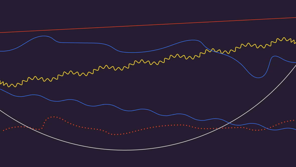
Our line patterns are extremely useful for depicting our journey from old ways of practicing medicine to new, from idea to innovation, and from pharmacist to patient. We encourage exploration and expansion of these patterns with new and interesting visuals expressions of these ideas.


Line
Combinations


Brand in Action
How to use all this good stuff
There's a lot to our visual design language. It can be overwhelming. But with the right mix of creativity and adherence, we can arrive at captivating and consistent visuals that build brand awareness, perception, and preference.
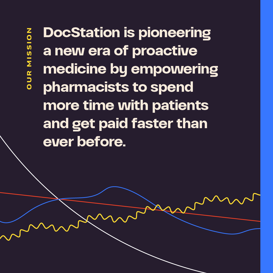
For information that consists of more than a few words, use Blurple as your graphic’s background with Paper or Beige-colored headline text. All of the highlight colors—Rorange, Flame, and Focus—can be used as eyebrow/subhead text colors on Blurple backgrounds.
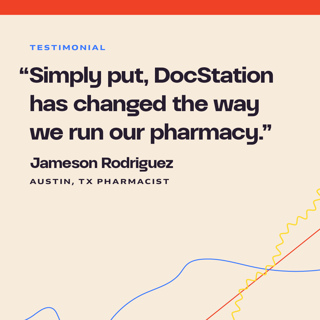
Beige or Paper backgrounds can also be used with Blurple headlines. Don't use Innovation Flame for text on Beige backgrounds, as the contrast is not sufficient to be legible. When paired with text, abstract line art should always appear below the text at the bottom, or bottom-left, or bottom-right portion of the composition.
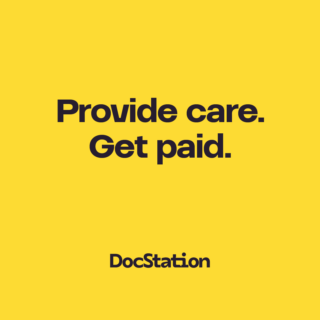
Highlight colors can be used for simple text graphics consisting of very few words.
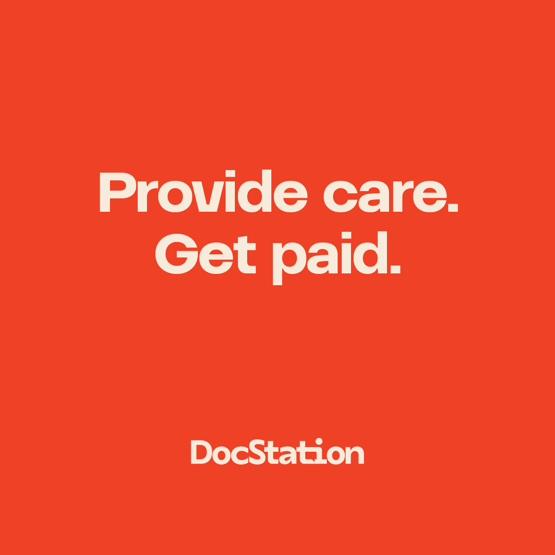
Feel free to center-align text in such instances.
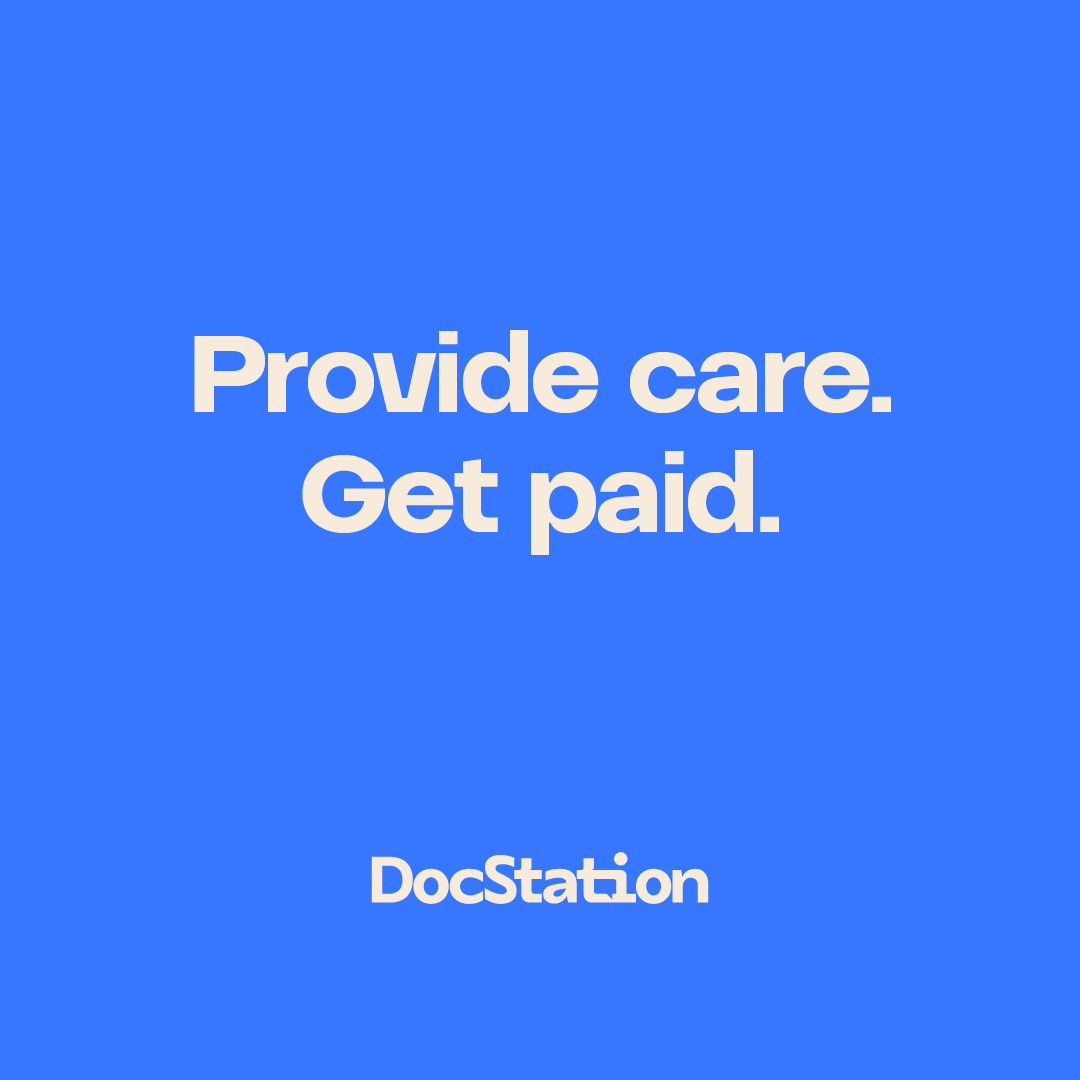
On Flame, use Blurple as your text/logo color. On Rorange and Focus, use Beige as your text/logo color.

To brand photography, feel free to add a multiplied wash in one of our highlight colors.
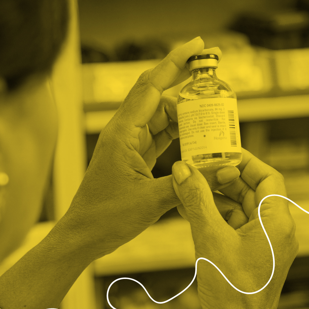
Abstract line art doesn’t always have to be used in groups. Single lines can be just as impactful in branding photography.

Try to crop images close to create a more editorialized feel to the photographic compositions.
Feel free to mix real-life elements with vector elements to make the graphics all our own.

Abstract line art should enhance the impact of photography.

Our branded elements should interact with still photography, especially on flat photographs like the above.

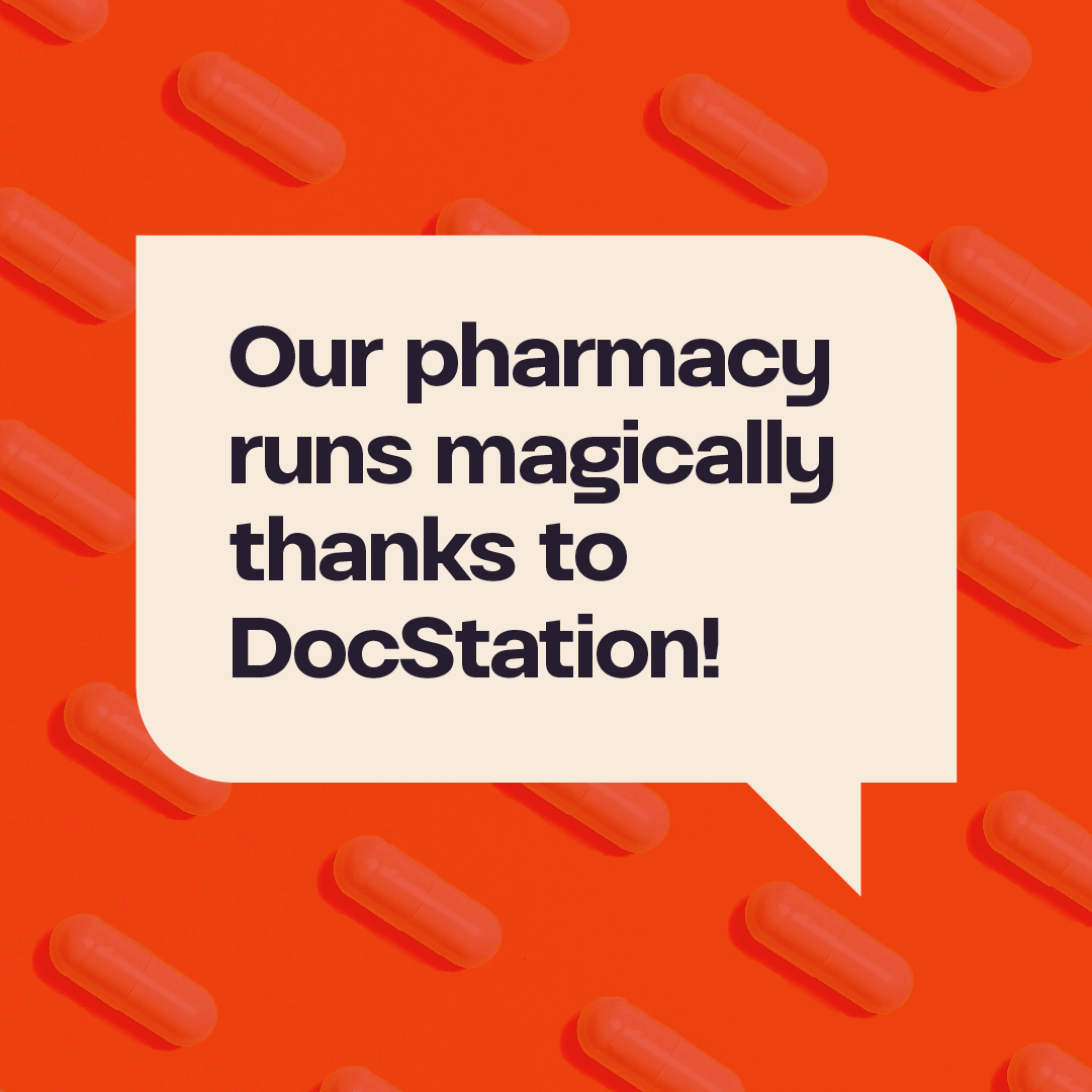
Line art can also be used to create simple but effective abstract illustrations that compliment features or headlines.

Team member bios can be placed inside of a round-corner mask that roughly matches the shape and proportions of our chat bubble Easter egg.